
Lowe's Chat — Invite Optimization

Chat Invite Optimization
Redesign Lowe’s Chat invite to capture user attention, drive desired engagement and reduce shoppers starting chats unintentionally.
Problem Statement:
Current chat invites are ineffective at capturing user attention and driving desired engagement due to specific issues.
Intrusive and disruptive design
Unclear value proposition
Lack of personalization
Therefore, we need to redesign the chat invite experience to:
Increase chat invite acceptance rates
Enhance user perception of chat as a valuable resource
Minimize user disruption and improve overall user experience
Enable more targeted and personalized invitations
Comparative Analysis
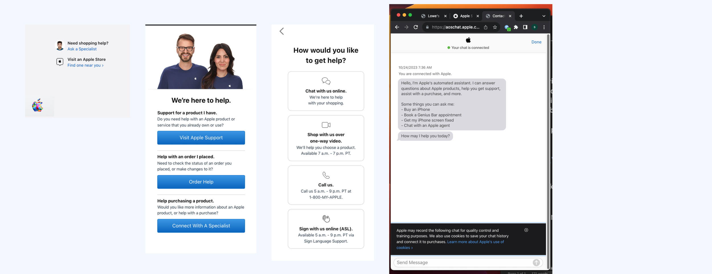
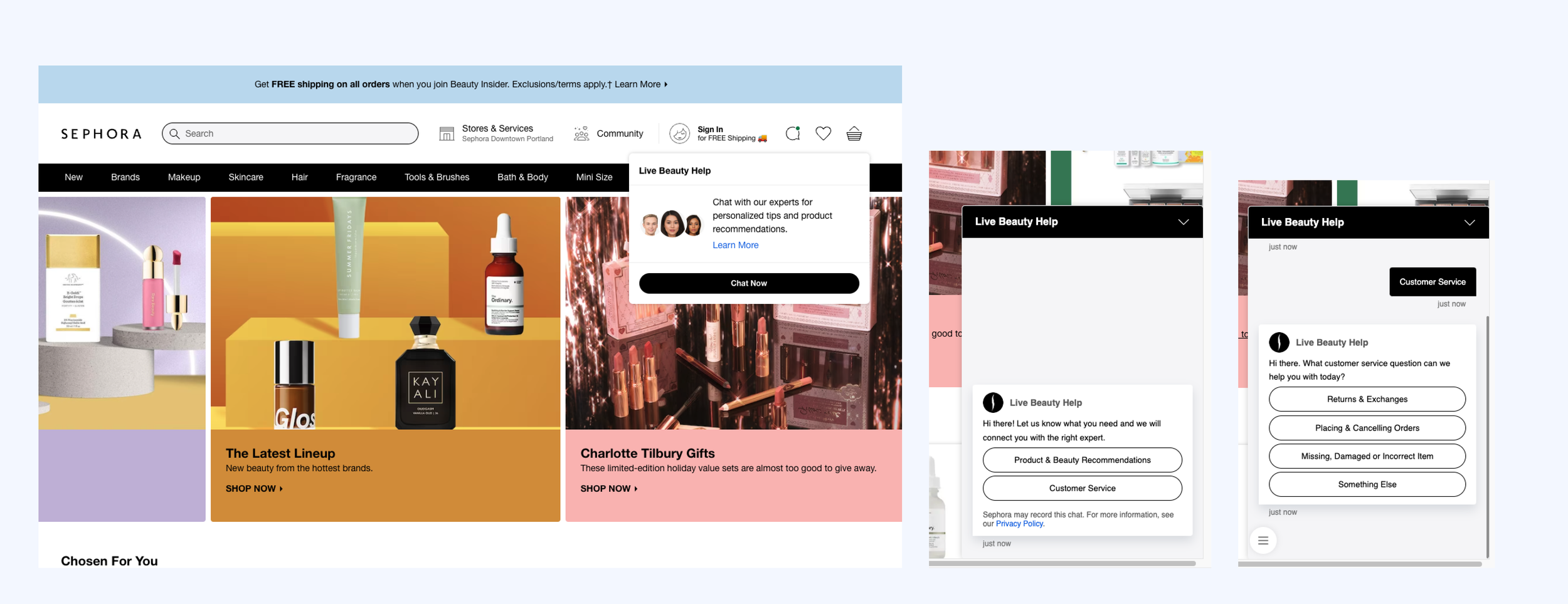
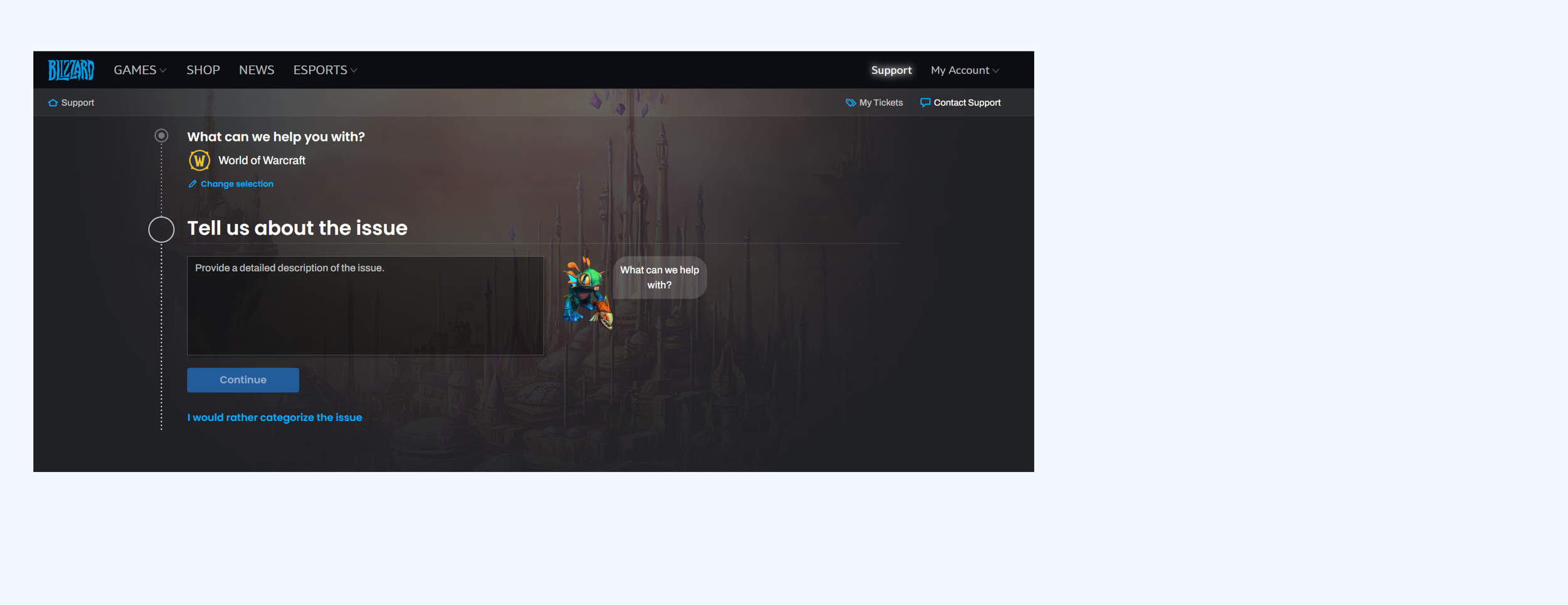
Analyze and compare different chat invite approaches across various platforms and industries, including an examination of key competitor strategies within the target market.
Best Buy

Apple
Sephora
Current Chat Invite Experience
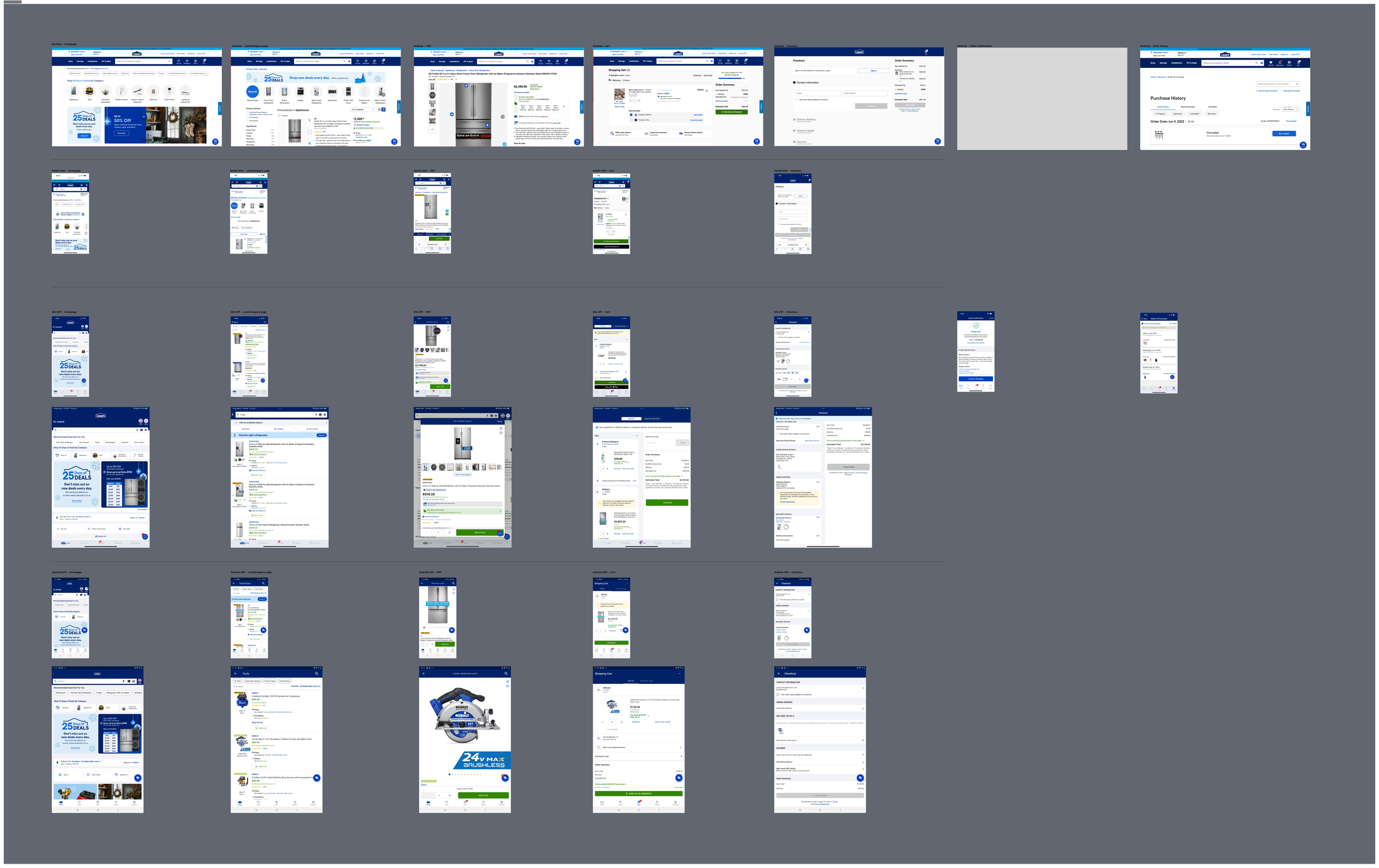
Identify the current chat experience (design and location) on the Lowe's website. Analyze inconsistencies and opportunities for improvement in the new design.
Location by user shopper journey: Homepage, PLP/PSP, PDP, Cart. Checkout, Order Confirmation and Order History.
Platform: Desktop, MWeb, iOS APP and iPad, Android and Tablet
Product Design Strategy
We've broken down chat invites into three key areas:
Icon: Visuals (shape, color, animation)
Content: Personalized Messaging (customer-specific)
Placement: Location (visibility, prominence, disruption)
Research Design Strategy
We've broken down chat invites into three key areas:
Icon research: What are users’ interpretations of the different icons?
Content research: Which copy communicates the Digital Red Vest feature?
Placement research: How easily are users able to locate Chat with differing locations/shapes?
Ideate and Research
Evaluate nine icon designs: eight potential new designs and one (“H”current with in chat icon).

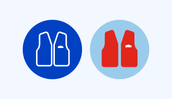
Blue vs. Red vest icons:
The vest icons were readily identified as representing a Lowe's employee by most participants. This led to expectations of customer service, primarily through chat or phone, with some suggesting in-store assistance.
However, the red color of the vest confused some participants, as Lowe's is strongly associated with blue. They speculated that red might signify a higher position or a specialized role.

Illustration vs. photo:
Participants expected to use the Leo icon for general help or support, perceiving it as more automated. The Live Agent icon was anticipated for live chat or call center interactions, suggesting human assistance."

Lowe’s Logo:
Most participants immediately associated the Lowe's Logo with a Home button, with a few suggesting it could also be a store locator.

Single vs double speech bubbles:
Speech bubble icons were generally perceived as generic Chat indicators. Participants anticipated initiating chats with either bots or live agents to obtain help or answers.
A few participants suggested that single chat icons might represent app messages or alerts, such as delivery or stock notifications.
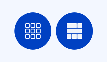
Waffle vs Varied:
Without the DRV feature context, these icons were confusing.
The Waffle Grid was often mistaken for a menu or app launcher, with some comparing it to the iOS app grid or Google menu.
The Varied Grid was frequently associated with building materials, such as bricks or lumber, due to its visual similarity."**
Which icon Best Represent the Digital Red Vest Chat experience?
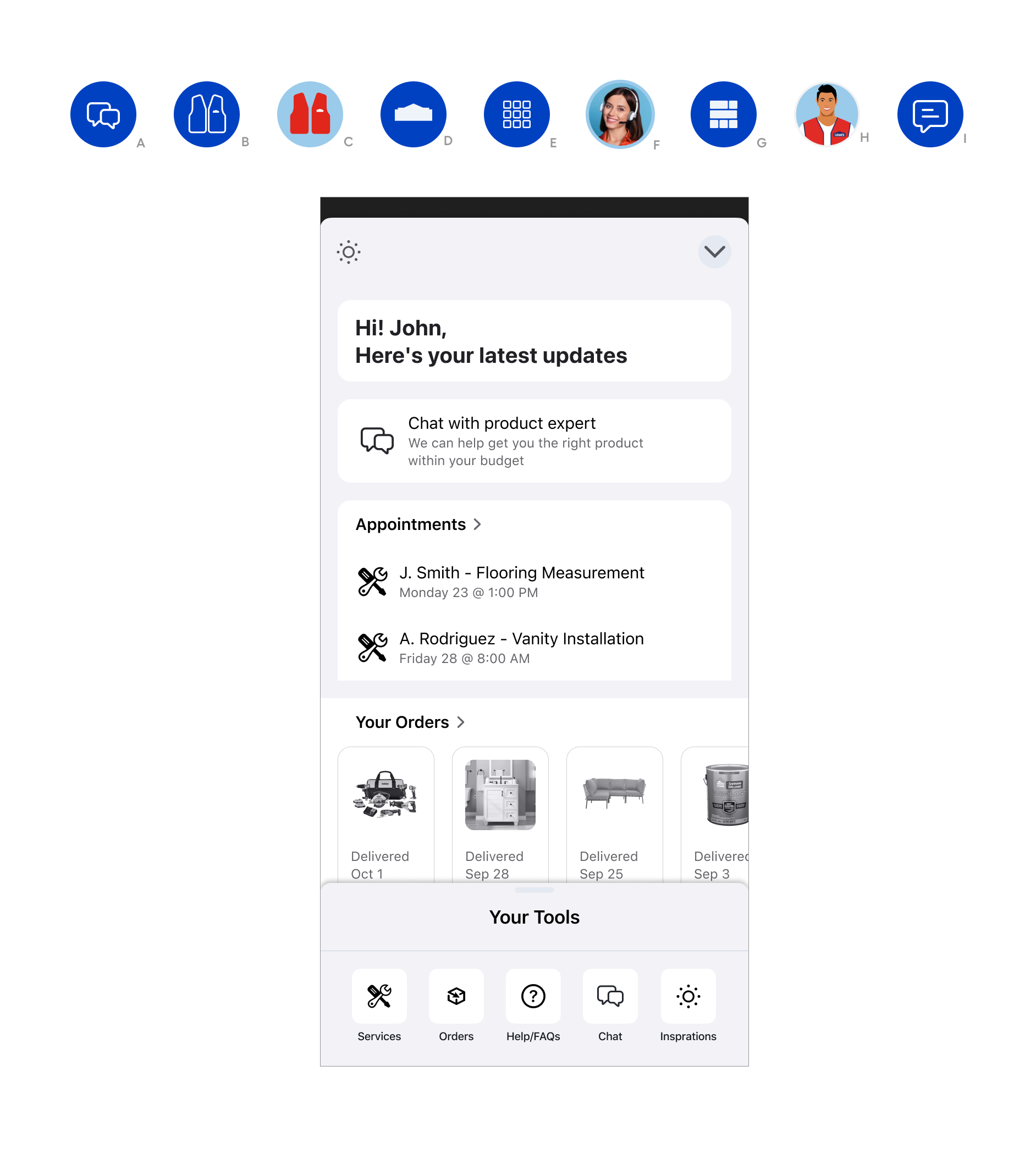
Chat invite variation unmoderated test.
Icons that best represent DRV
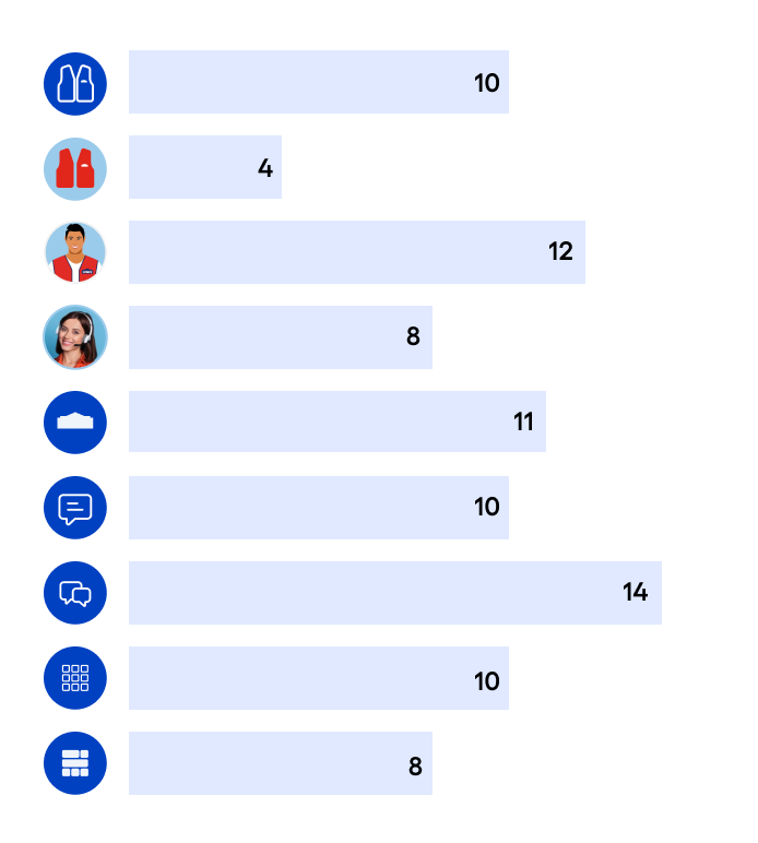
Double Chat & Leo: Frequently selected as top choices, aligning with DRV's focus on help, information, and customer service.
Lowe's Logo & Waffle Grid: Perceived as more suitable for the diverse range of DRV features, conveying broader access to tools and information.
Specificity Concerns: Icons like Leo and Live Agent were seen as too specific (e.g., solely for communication), while the Lowe's Logo and Waffle Grid were considered more versatile.